VISUALIZING
Homepage: http://www.visualizing.org/
Tool Category/ies: Creativity Innovation Social Networking Presentation
License Type: Free
Overall Rating
4/5
Visualizing.org is a community of creative people making sense of complex issues through data and design... and a shared space and free resource to help you achieve this goal.
Other Tool Types
View All Tools
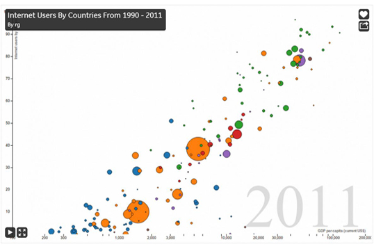
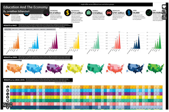
Example from Visualizing Community
Example from Visualizing Community
1 of 3
Rating: 4/5
Reviewed by: Greg Jonason on 04/09/2013
Description
Data visualization is a necessary component of conveying complex processes or large amounts of information for comparison to others that may not be familiar with the material, process or subject matter. As mentioned in the mission statement of the website, this site was created to make data visualization more accessible to the public.Making this more accessible to the public does a great service since our world has become so information rich. Huge data sets can overwhelm if it is not communicated in a way that is not only organized, but also interesting and intelligible to others. The social component of the website allows for sharing of the data uploaded or generated by different users within the visualizing community.
Visualizing.org has hundreds of samples that are categorized by topics of our interest such as education, health, and business. Several featured end products have beautiful visualization and great detail with some level of interactivity for users to explore the data. Data visualizations use various types of graphics colors and other means to explain the data set. In addition to all the examples and shared visualizations open data sets are available through Visualizing.org which, can be turned into visualizations for analysis.
Things to know before using Visualizing
Either your own or publicly available data set or research area you want to analyze. Details of what sections or ideas that need to be covered in the data visualization that you want to create. An idea of how you want to present/view the data set to deliver the message in a meaningful way.
Resources required to use Visualizing
Spacial and Visual capability software like Gimp, Photoshop,Flash, HTML 5 Illustrator to create your own data visualizations. To create visualizations from existing open data sets in visualizing latest version of flash and java plug-ins are required.
How to use Visualizing in a teaching environment
Data visualizations help in organizing large amount of data in a visual and meaningful way. Ususually team members can be formed to work on creating a data visualization where members can focus on content, design, presentation and creativity. Based on the goal or research area of a project data visualizations can be used to develop team spirit and present extensive data in a creative way. e.g. using the online data set from the website students can compare the quality of water that households in the different states in America receive.
Contrarily, data visualizations can be used to understand concepts and ideas e.g. My assignment might be for the students to classify different data visualizations that they find on the site and align them with the different "periodic table elements" shown on this site:A Periodic Table of Visualization Methods
http://www.visual-literacy.org/periodic_table/periodic_table.html
Advantages of using Visualizing
Building team work, creatively presentation of data, meaningful presentation of extensive information, research using open data from website on various topics like health, education, water resources, technology etc., discuss data visualizations on specific topic in a community.
Disadvantages of using Visualizing
The "creativity" aspect of the site is limited because that is something that you would have to do on your own. It would be great if they had some type of visualization templates that you could use to start you off on a visualization project of your own. Majority of creative visualizations must be completed on your own and ready to upload into the website for viewing and/or sharing. The tool only provides limited number of ways to present data e.g. bar graph, scree plot, pie graph etc.
Examples and External Resources
World Wide Water Quality 2011 from Visualizing.org uploaded on 04/09/2013
©2011- The University of Houston. All rights reserved.
4800 Calhoun Road, Houston, Texas 77204 (713) 743-2255